


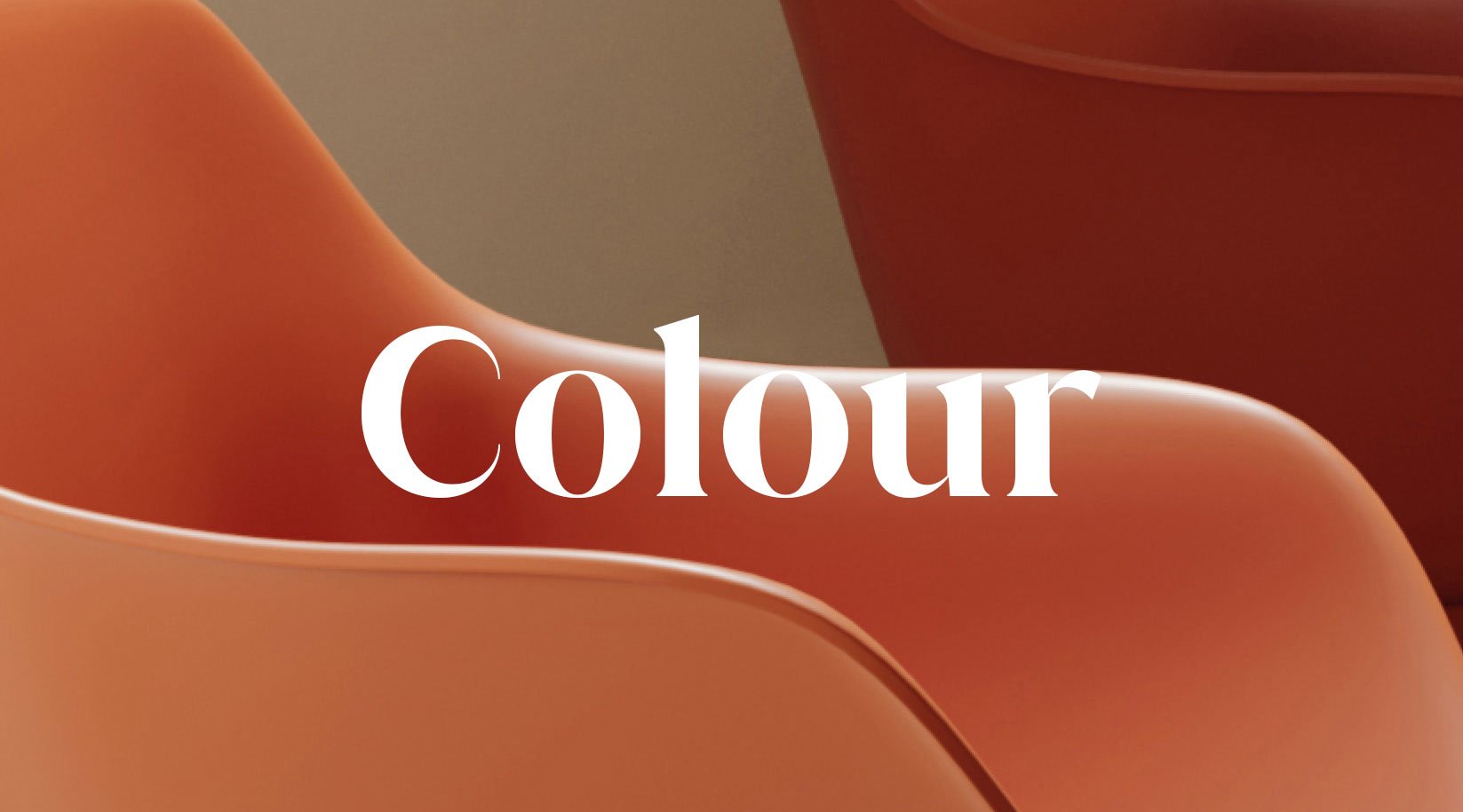
One of the most effective ways of creating spaces that feel human and habitable is to apply colour palettes that derive from nature. Earth and sky, woods and fields, lakes and rivers, mountains and the ocean – studies show that the colour wheel of the natural environment makes people feel calm, reducing stress and enhancing wellbeing. More than ever, interior designers, architects and scheme specifiers around the world are following biophilic principles in colour selection to craft destination space.
We know this because at Boss Design we’ve been collecting and analysing data which gives us insight into what colour, finish and fabric selections our customers make when ordering. Using live data to assess where colour tastes are going, combining that with our own trend research and taking into account the design thinking behind our product lines, we have reshaped the standard Boss Design colour palette for roll-out in the second quarter of 2024.
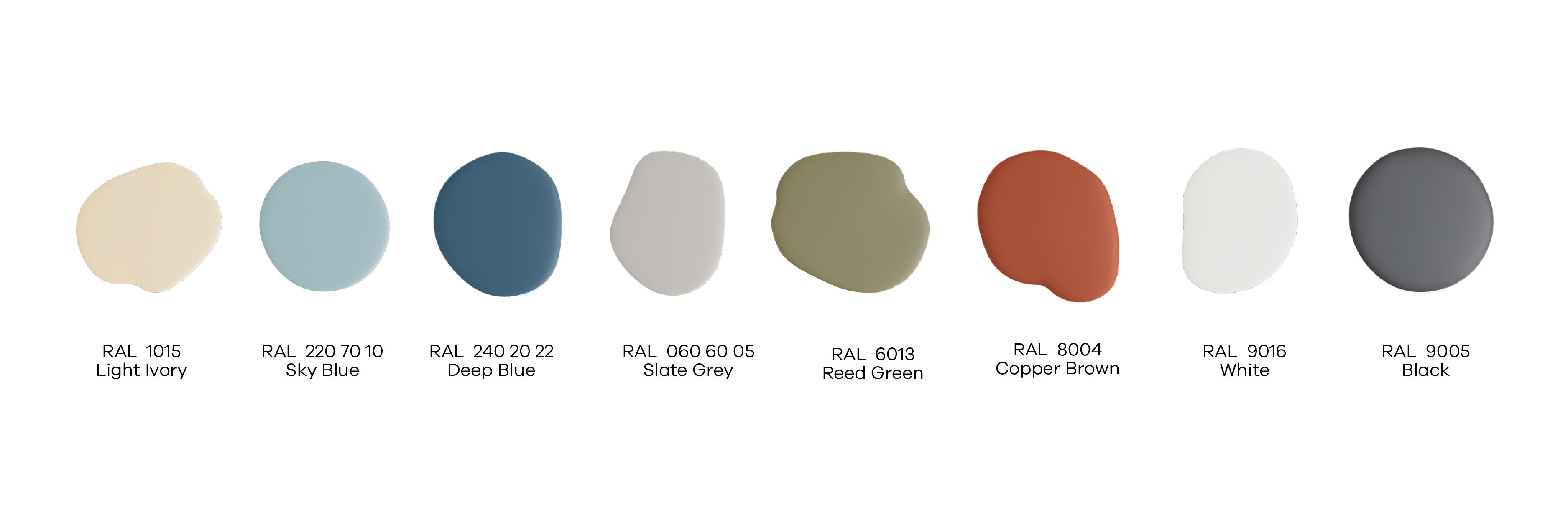
This may sound very grand, but the eight natural and biophilic colours in the new palette represent evolution rather than revolution. Our data shows that while people express interest in bright colours, they aren’t often specified. Rather than defining one or two highlight colours, this palette provides a tranquil set of tones to build upon – whether and which accent colours are used is up to the designer.
Positive spaces
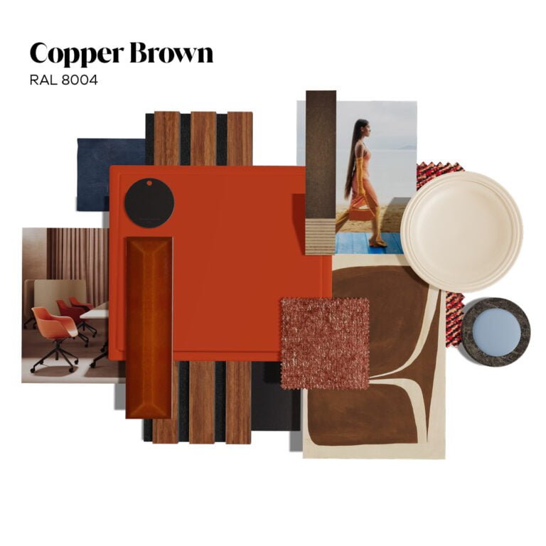
Reed Green and Copper Brown were introduced in 2022, as part of a special colour palette created for Sia, one of the most sustainable task chairs on the market. They have enjoyed very positive traction with our clients, and to measure the popularity of these colours on other ranges, I have introduced them in small doses within the London showroom – on the legs of a Sol table and on our recently launched laptop table, Lina, for example.
Hanna Stauch, Interior Designer, Boss Design
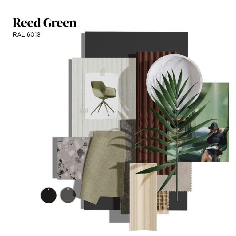
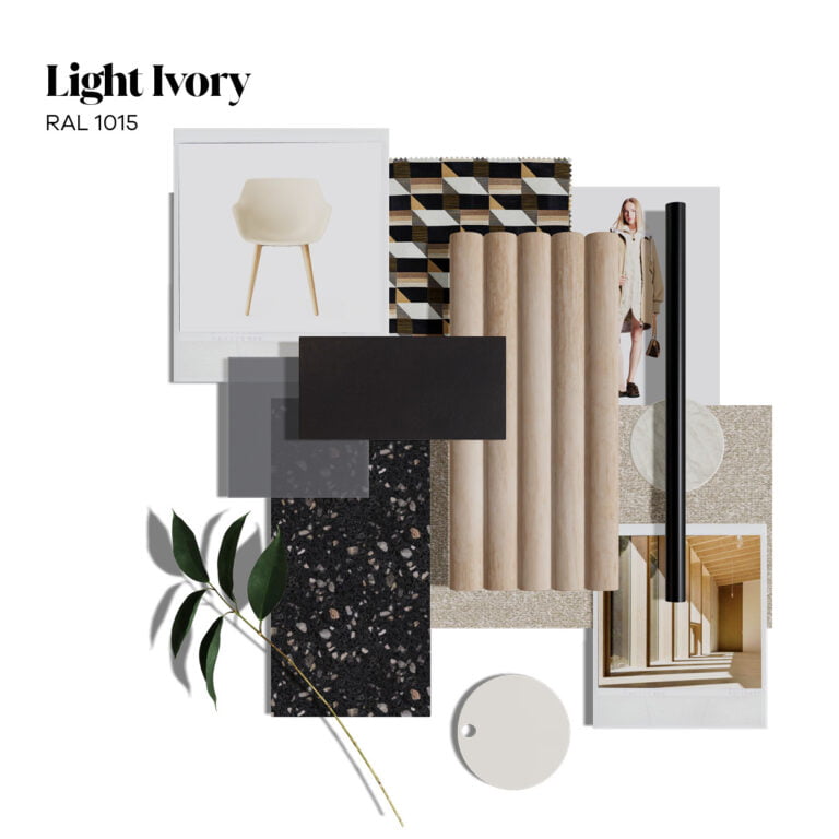
The popularity and future potential of Reed Green and Copper Brown has seen them added to the standard palette alongside Sand, which is a more neutral tone while still offering warmth and tactility.
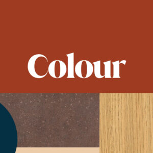
Sky Blue, Deep Ocean Blue, Slate Grey, Black and White complete the set, rounding out a colour palette of eight tones that all work comfortably with one another and reflect the natural world. There is a touch warmth and vibrance, plenty of tranquility, while at the same time avoiding the earthier dark browns, greys and greens sometimes associated with biophilic design.
Ola Tub
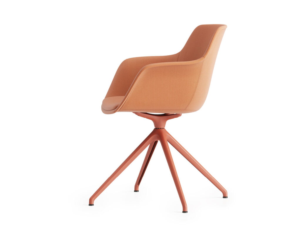
4 star with Copper Brown painted base
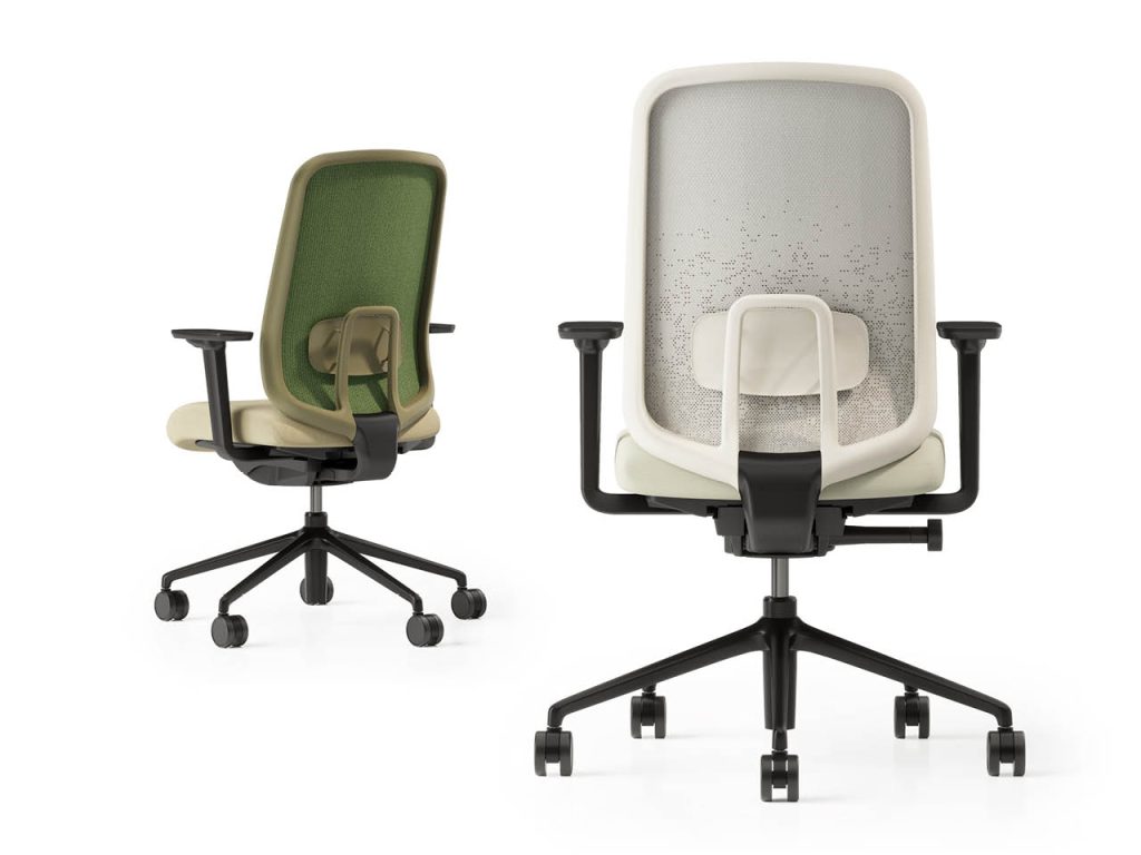
Sia Task Chair
Reed Green & Oyster White
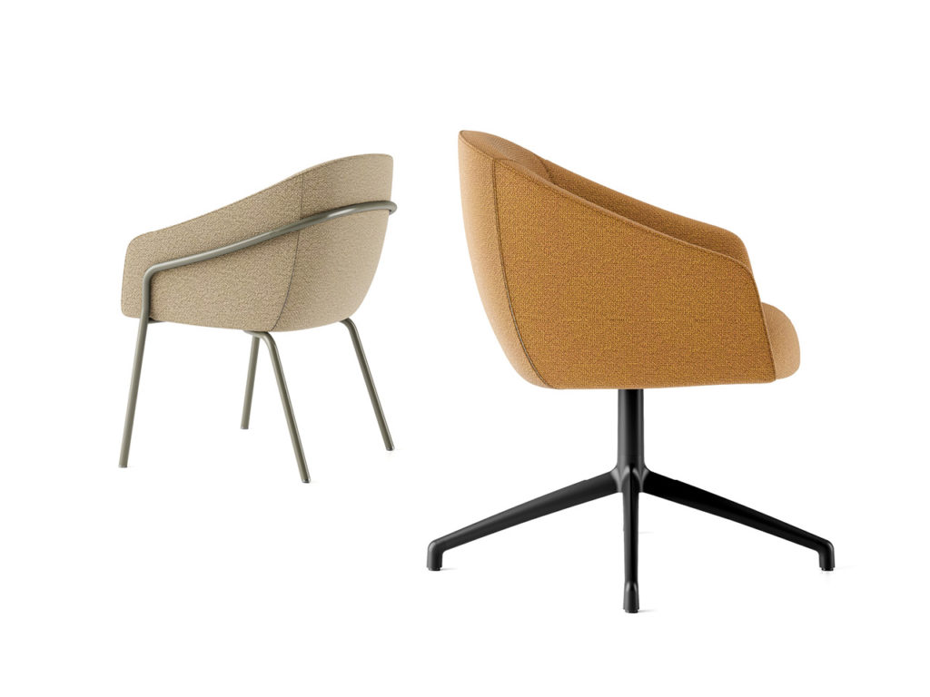
Paloma Meeting
Reed Green 4 leg and Black swivel base
Colour and sustainability
Like the colour palette we developed when we launched the Sia task chair, having a nature-inspired selection of tones aligns with Boss Design’s drive towards sustainability in the commercial furniture industry. However, it is more than a statement of intent.
Firstly, it has an aesthetic purpose. Smooth, natural, organic lines are part of the visual language of our furniture collections, from our popular wingback chair, Amelia, to the Frida focus pod, and from the Bodie lounge collection to Agent tables and chairs.
Secondly, and in combination with the above, it is a palette carefully honed for the creation of destination spaces. Across workplace and hospitality environments, it can be used for the application of biophilic design principles. Used in conjunction with plants, natural light and organic textures, with good air circulation and fresh food and drink available, biophilic design leads to an atmosphere that is reassuring, calm and serene.
The human-nature connection puts the brain at ease, lowers the blood pressure, allows for recuperation, improves concentration and fosters creativity. The colours in our 2024 palette make that connection, helping the organisations we work with become more sustainable in the long run, contributing to productivity and profitability.
Boss Design – March 2024

Please wait while you are redirected to the right page...